MSource
MSource is a boutique sales and marketing agency for food manufacturers, focusing on prepared foods to grocery delis and University foodservices.
UI/UX Design + Web Design & Development + Branding + Stock Photo CURATION + Graphic Design
Goals
MSource has been in business for 15 years. Its mission is to help established, growth-minded prepared food brands and companies grow to their full potential. Lionel Binnie, owner and CEO of MSource, came to me looking for a fresh new redesign of his branding and existing website.
According to Lionel, “While I expect many of my new clients to come from my outbound, sales efforts, and networking, some prospects may find me through SEO. In other words they may be inbound. For inbound web sources, my website is my main tool for engaging new prospects. And for my outbound efforts, I still want my website to represent me well, to solidify trust – any prospect will use my website to confirm their decision to work with me or not.”
Branding
Lionel expressed that his existing logo was not memorable or fun. He also wanted to change the tagline “Channel Marketing Strategy and Execution”, which was obscure. People didn’t really know what that meant. He wanted the new logo and style of the website to convey creativity, fun, trust, reliability and results. He said “food is fun, food is life, and food business is necessary and creative.” He wasn’t sure about the color palette, but liked the color red. He wanted the tagline to be “Grow Further”. So I kept all of this in mind when designing logo concepts, color palette and fonts.
Logo, Color Palette and Fonts

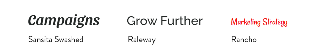
Logo DESIGN PROCESS
I began by creating three distinct initial logo concepts, each exploring a different visual direction. This was the concept that resonated most, and I moved into refining the design, and exploring multiple color schemes and variations. Finally, I prepared a complete set of production-ready versions for web and print.
For the website, I chose heading and body fonts that fit naturally with the brand, helping the typography strengthen MSource’s tone and personality.
Website Challenges & Solutions
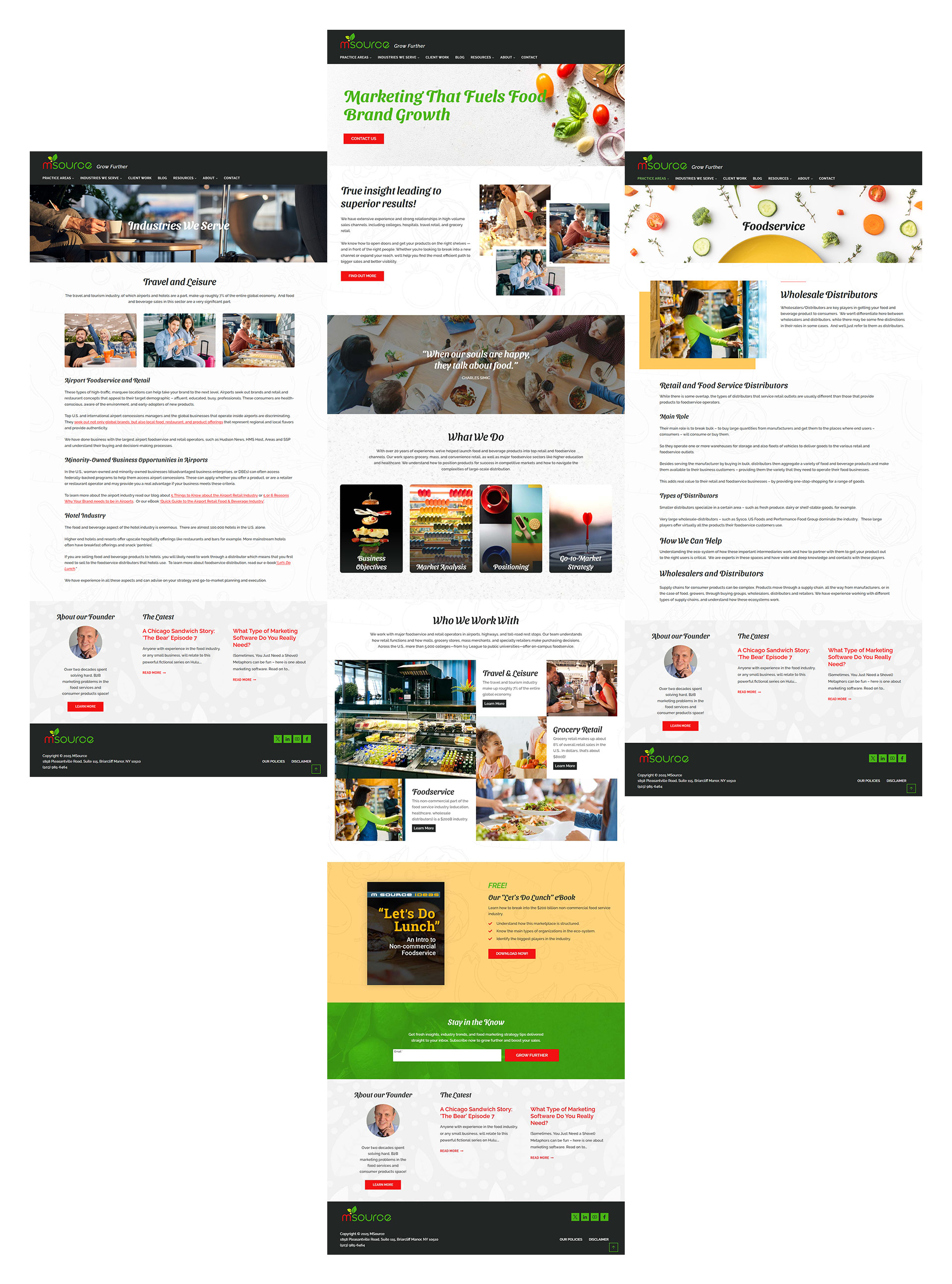
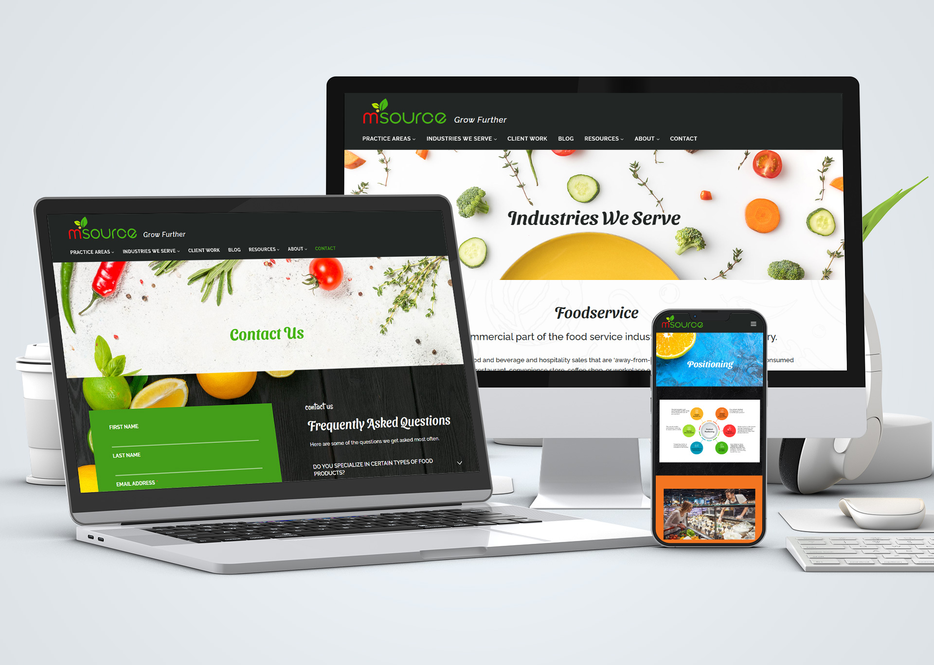
The original website had been in existence for years, and over time, the main navigation became disorganized and cluttered. Lionel worked on streamlining content into fewer, more focused, new pages. Once that was completed, we reorganized, simplified, and improved the navigation.
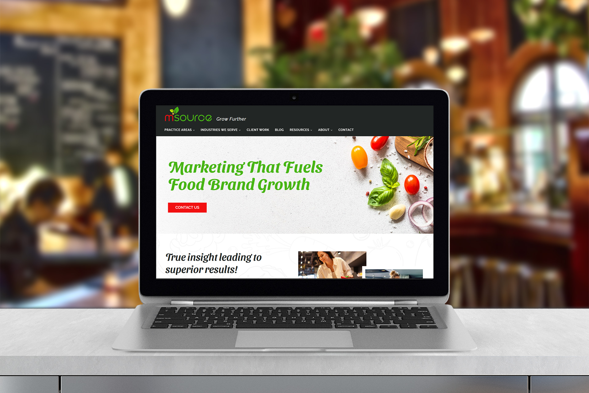
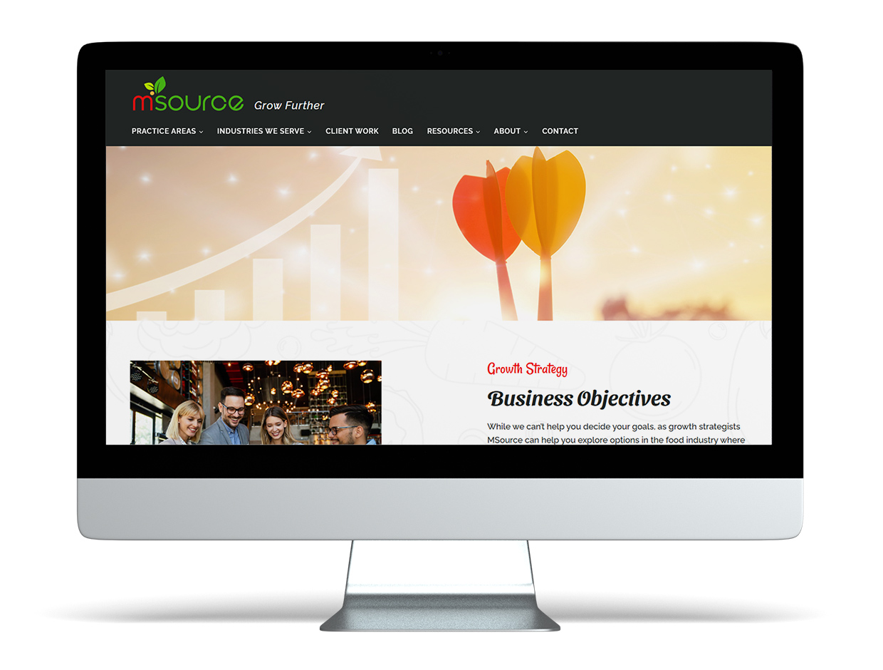
From the beginning, I prioritized using high-quality, professional imagery. I carefully selected stock photos – including images featuring people – to best complement the brand and add a more human, relatable feel to the website.
I put thoughtful attention into crafting the responsive styling, making sure the website looks clean, cohesive, and beautiful on every screen size. I created muted background graphics to enhance content sections, and added animations to enhance user experience and engagement. I created three infographics that aligned with the new branding (separate project). To provide easy access to key pages within the main navigation, I added homepage buttons linking directly to them.
The final result
The website is visually contemporary, bold, fresh and vibrant, easy to navigate, clean (non-cluttered), with a cohesive and consistent design throughout.
“Alexandra completed my logo and website redesign project on time and produced great quality work. She is a talented and well-trained designer with a great eye for color and design, typography, images. She listened carefully for input and direction and also was responsive to feedback and made several revisions. She is also skilled in WordPress and other website software technologies. I would highly recommend Alexandra for any graphic design and artistic as well as digital design and digital design implementation projects.”
Lionel Binnie
MSource
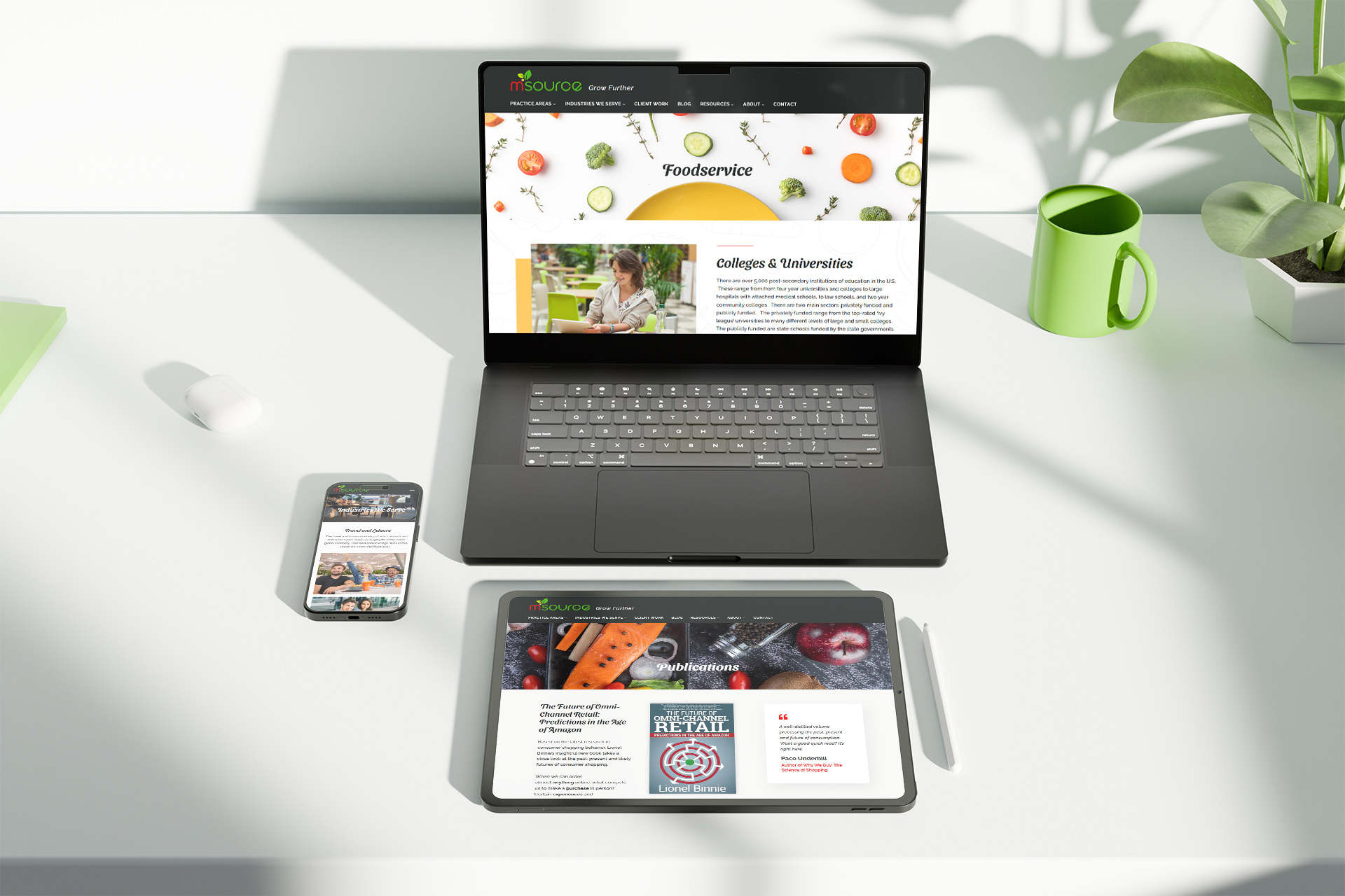
Responsive Design
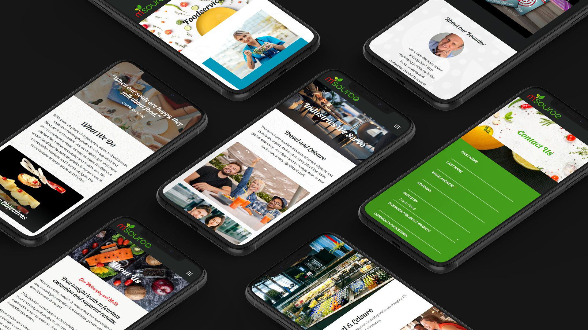
Website Presence