Macbook Display of Ps103 Life in garden setting

Ps103 Life

Ps103 Life is a health & wellness ecommerce website.

UI/UX Design + Branding & Product Design + Accessibility Design + Web Development + ecommerce design + Content Strategy & writing

Insights

~3 mo
Concept to Launch
$18K+
Estimated project value
WCAG 2.1 AA
Accessibility standard met
28
Products designed

Overview

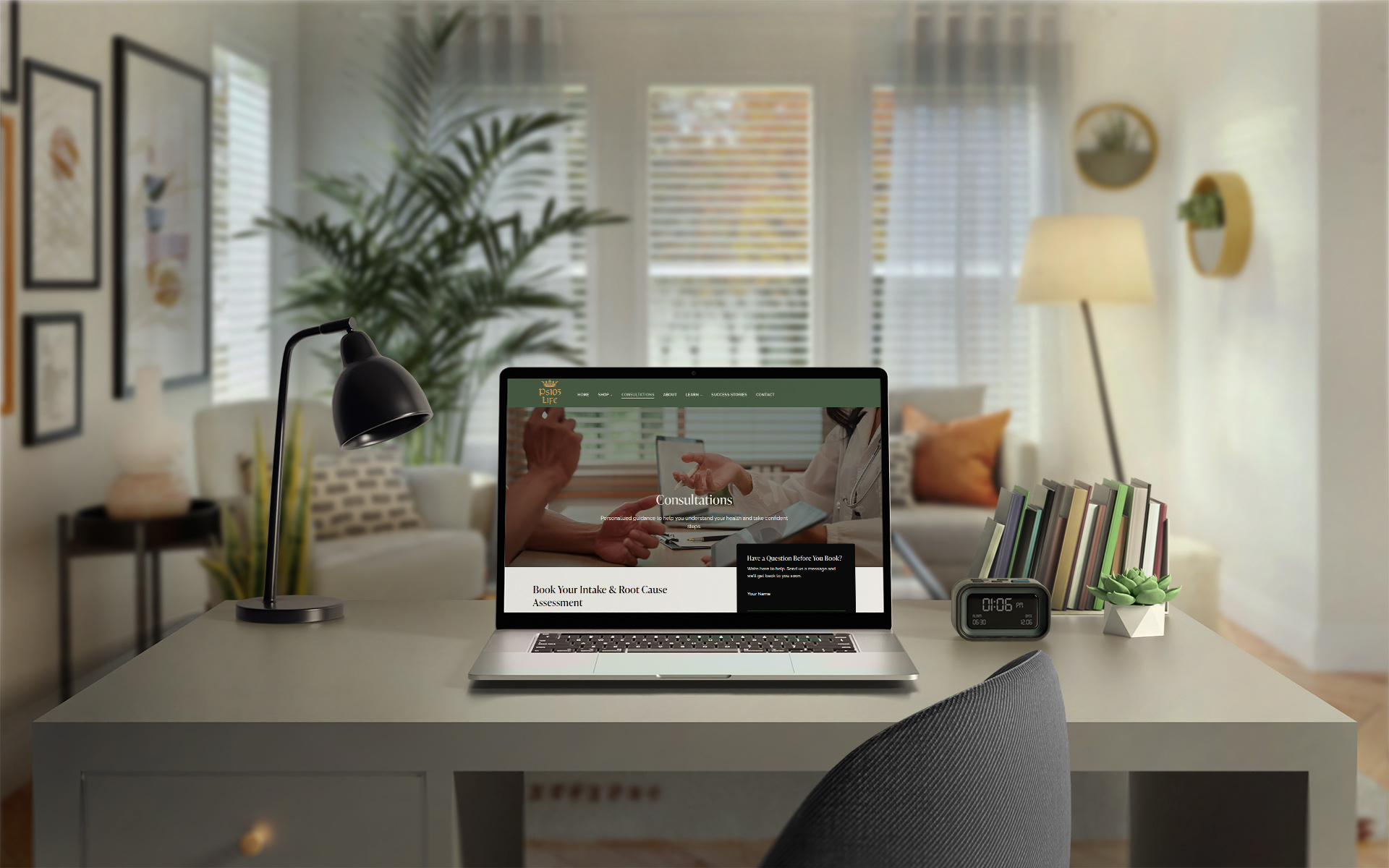
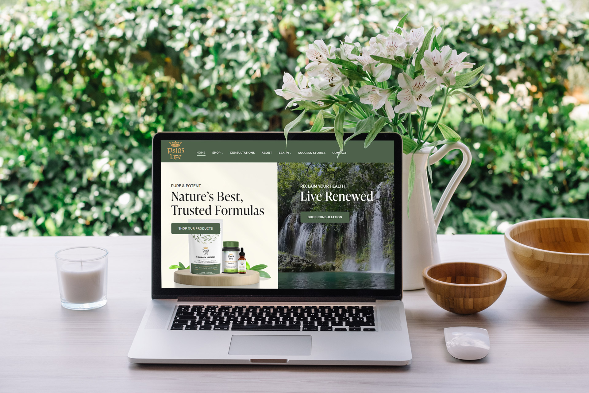
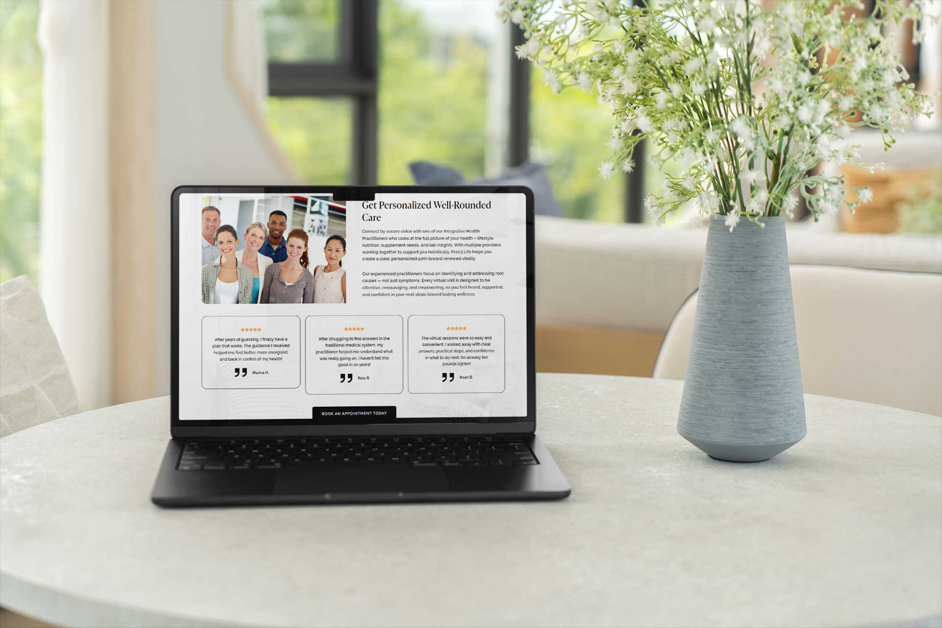
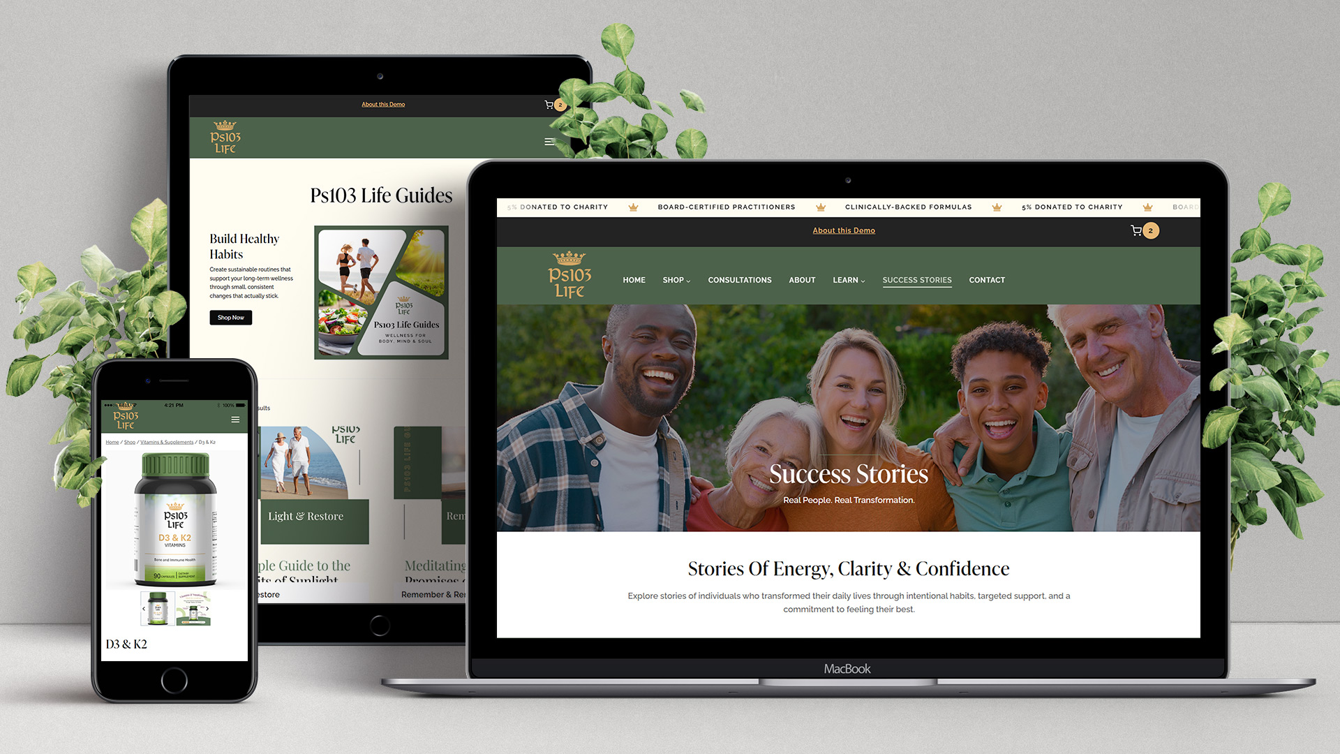
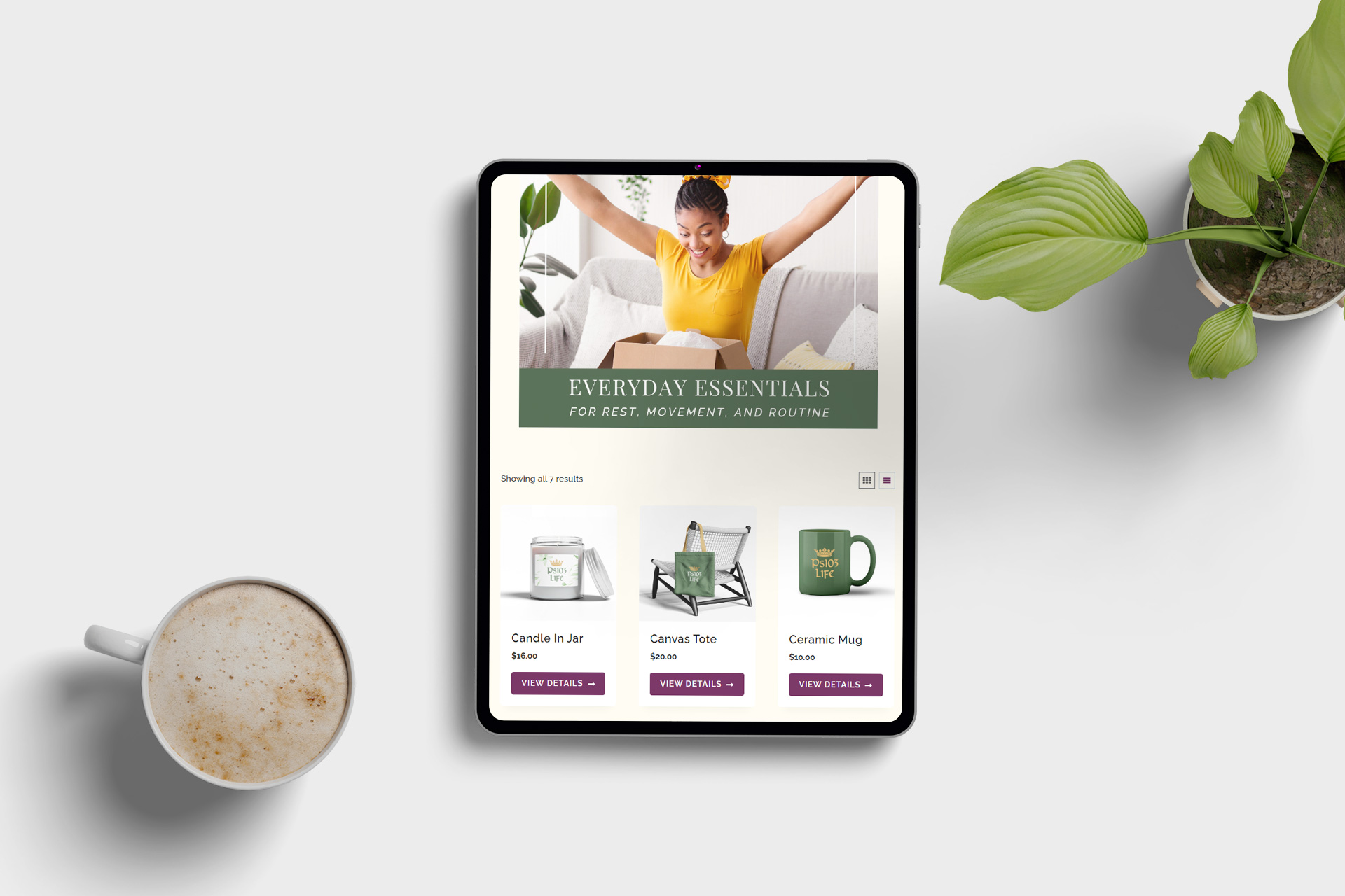
Ps103 Life is a fictitious holistic health and wellness brand built from the ground up to show what a real ecommerce wellness business looks and feels like — from the homepage to online store, telehealth consultation booking, a health topic learning hub, and client success stories — while staying transparent with visitors that it’s a demo.

The project was self-directed, with no client deadlines or creative brief. That freedom made space for a depth of design and functionality that a typical project rarely allows — and it intentionally puts the full range of skills a potential client would be hiring on display.

Ps103 Life best-selling supplements displayed on iMac

Branding

The name Ps103 Life is rooted in Psalm 103:1-5 – God’s promises of restoration, healing, and vitality. The brand identity was built around that same idea, blending the power of natural solutions with the promise of renewal. The result is a visual language that feels natural and earthy, yet clean and modern.

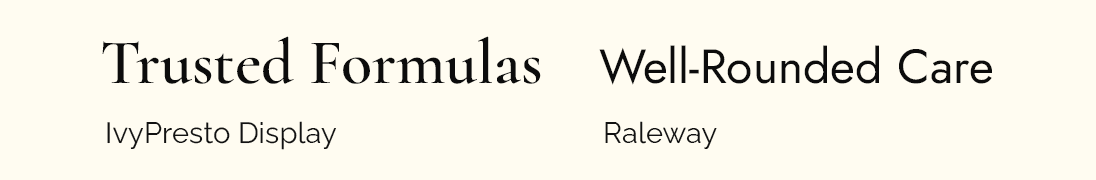
Logo, Color Palette and Fonts


Ps103 Life Logo
Color Palette for Ps103 Life
Fonts for Ps103 Life
Viewing Ps103Life.com on MacBook in sunlit room

Project PHases

Before a single page was built, extensive research went into understanding the health and wellness ecommerce landscape – analyzing organic supplement brands, telehealth platforms, and holistic wellness sites, with a close eye on homepages, navigation structures, product presentation, content and branding.

From there, the concept took shape:

  • Defined the brand: a holistic wellness destination offering natural supplements, telehealth consultations, client success stories, and a natural remedies learning hub – anchored by the tagline “Live well, naturally. Empowering body, mind, and spirit for vibrant living.”
  • Mapped out the site architecture, navigation, homepage sections, key features, and product categories.
  • Decided which features would be fully functional and which would be intentionally limited – including payments, appointment scheduling, and form submissions.

The brand needed to feel premium, natural, and trustworthy – without looking clinical. The palette of forest green, sun gold, cream, and near-black was chosen first for aesthetics, and then verified for WCAG 2.1 AA color contrast compliance.

  • The logo was designed in Illustrator featuring a crown (symbol of royal inheritance) set with a heritage typeface, with the crown rendered in gold across all color variations.
  • Heading font: IvyPresto Display, a luxury serif that brings elegance and weight. Body font: Raleway – a clean and modern typeface which complements IvyPresto Display very well.
  • The color palette was tested for accessibility.
  • The brand identity was applied consistently across every touchpoint – web, product labels and containers, merchandise, custom icons, and imagery.

Site architecture and navigation structure were carefully considered from both a UX and conversion standpoint – ensuring visitors could quickly understand what Ps103 Life offers, find products with ease, book a consultation within two clicks, and explore natural health resources.

  • Designed custom mega menus for the Shop and Learn main navigation links, using Kadence Pro’s Hooked Elements. The Shop mega menu features five product category columns, while the Learn mega menu presents three image-and-text links leading to dedicated resource pages.
  • Designed the responsive header and mobile menu, along with a footer that stays clean and organized despite housing a lot – logo, tagline, quick-nav menus, email signup, social icons, and policy links.
  • Added a top bar for cart access and key at-a-glance information.

The homepage was designed as a conversion-focused landing page – every section serving a clear purpose, whether that’s driving product discovery, building trust, or encouraging consultation bookings.

  • Split hero banner with background video, and dual CTAs to immediately engage visitors and direct them toward key actions.
  • Best-selling products, an overview of the Ps103 Life integrative health practitioners with testimonials, and a statistics credibility bar
  • “Mind. Body. Spirit.” brand positioning section reinforcing the holistic philosophy behind the brand.
  • Scrolling client Success Stories, a Shop by Benefit section (browse by health concern to find relevant products), certification badges, and a “Raising the Bar” trust section.
  • Sections dedicated to the WellSpring Renewal Project donation initiative, product testimonials, a membership CTA, and email signup.
  • Consultations page: details on booking an Intake & Root Cause Assessment, an FAQ section with contact form, and three appointment types to choose from.
  • About page: Why choose Ps103 Life intro, mission statement, brand story, physician testimonial, partner logos, and links to product categories.
  • Contact page: three value-proposition cards, a contact form, and client testimonial.
  • Three “Learn” pages: hero images with Coming Soon placeholders – scope managed intentionally to keep the project focused.

Rather than a traditional blog, Success Stories were built as a custom post type – each one a full narrative page that reads like a real client’s journey back to health.

  • Wrote and designed six complete Success Story posts, each following a consistent narrative structure: Transformation Snapshot, Before the Change, The Turning Point, The Transformation in Motion, and more.
  • The archive page displays all six stories with click-through access to each individual post.
  • Each Success Story page includes a Share Your Story form, and a Similar Stories carousel to encourage further inspiration.

This was the most labor-intensive phase. Products needed to look real, high-quality, and cohesive – like a brand that actually existed on a store shelf.

  • Settled on approximately six products per supplement category – Vitamins & Supplements, Botanical Oils, and Powders – plus seven Lifestyle Essentials merchandise items, and four Life Guides (digital downloads).
  • Sourced container mockups on Envato Elements – supplement bottles, dropper bottles, and powder pouches – selected specifically for their cohesive look and feel.
  • Designed all supplement product labels in Canva using the Ps103 Life brand identity, then placed them into PSD mockups and optimized backgrounds, dimensions and file sizes.
  • Sourced merchandise mockups with a similar aesthetic and applied the logo for the Lifestyle Essentials product line.
  • Designed the Ps103 Life Guide covers in Canva for the digital download products.
  • Created secondary category images in Canva – branded and consistent – to power the ShopKit image gallery display on each product category page.

With products designed and ready, the next phase was setting up WooCommerce – entering all product images and information, then customizing the product detail pages and cart-to-checkout experience.

  • Product label copy was written in-house; ChatGPT was used to assist with the longer product descriptions.
  • WooCommerce was configured with full product info, variants, and pricing tiers, with the cart and checkout experience customized for a smooth and accessible, on-brand flow.
  • Kadence ShopKit was used to build a custom product loop template, shop archive pages with filtering, and single product page templates.
  • A custom above-the-fold section for the Lifestyle Essentials category was built using Kadence Hooked Elements.
  • Mini-cart dropdown, cart notifications, and product badges were all customized via ShopKit for a polished, cohesive shopping experience.

Kadence is accessibility-friendly page builder out of the box, which made this process significantly more achievable than it would be on many other platforms. That said, achieving WCAG 2.1 AA compliance ultimately comes down to the designer and developer. Accessibility was kept front of mind throughout every page, section and template – but formal testing, as it always does, surfaced errors to remediate and alerts to address.

  • Accessibility tools used: WAVE, axe DevTools, and Lighthouse
  • Issues tested, passed or remediated included: text alternatives, heading hierarchy, keyboard accessibility, skip to content link, logical focus order, proper focus states, color contrast, color not used as the sole means of conveying meaning, moving content that can be paused, descriptive page titles, meaningful link text, clearly identified errors, descriptive error messages, form input labels, valid HTML markup, proper name/role/value for all UI components, announced status messages, and correct ARIA usage.
  • It’s worth noting that tools like these sometimes flag false positives – many of the color contrast errors fell into this category.
  • Several accessibility issues built into Kadence required custom Javascript, PHP, or CSS fixes. The Kadence support team was incredibly helpful in providing those fixes and reporting the issues to their development team for future improvements.
  • Ps103Life.com achieved a passing WCAG 2.1 AA result – a meaningful differentiator in a marketplace where accessibility is still widely overlooked.

The final phase was designing a thoughtful, non-intrusive way to let visitors know they’re exploring a demo – without it getting in the way of the experience.

  • Designed and implemented a site-wide scrolling marquee at the very top of every page to highlight key brand trust points and grab visitor attention.
  • A dismissible store notice at the top of every page delivers the essential context immediately.
  • An unobstrusive “About this Demo” text link in the top bar opens an engaging modal with richer detail – informative without being text-heavy.
  • The modal features an engaging layout with images, four concise sections, and two clear CTAs – one to continue exploring the site, and the other one linking to this full case study.
  • Completed a final responsive QA pass across desktop, tablet, and mobile breakpoints, refining spacing, alignment, and content throughout.
Three-device presentation of Ps103Life.com

Skills & Tools Used

Logo & Brand Design

UI/UX Design

Content Strategy & Writing

WordPress + Kadence Pro

WooCommerce + ShopKit

Photoshop & Illustrator

Graphic Design

Responsive Design & CSS

Accessibility Design

Axe DevTools & WAVE

Canva & SnagIt

WPCode & Rank Math SEO

Key Challenges & How They Were Solved

1

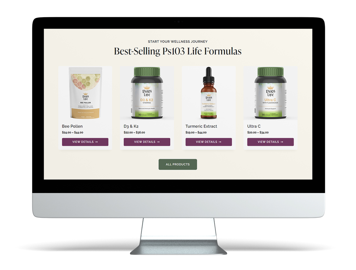
Creating a cohesive product line from scratch

Designing nearly 30 products that look like they belong to the same brand – across vitamin bottles, dropper bottles and powder pouches – required developing a consistent label system, and then carefully placing each label onto realistic mockups. The goal was to make every product look authentic, cohesive and shelf-worthy.

2

Fixing accessibility issues and passing WCAG 2.1 AA

Most accessibility issues were straightforward to resolve, but several required complex Javascript or PHP fixes tied to Kadence’s own code. The Kadence Support team was responsive and helpful, providing code fixes and escalating a few issues to their development team as product improvements. For the remaining issues, a combination of front-end coding skills and ChatGPT helped work through the solutions.

Achieving a passing WCAG 2.1 AA result on a complex ecommerce site was a significant accomplishment.

3

Communicating “this is a demo” without diminishing the experience

The solution was two-layered: a dismissible store notice for immediate context, paired with an engaging modal accessible site-wide via an unobtrusive “About this Demo” link. Visitors can explore naturally while always having access to the full explanation.

4

Learning how to Use Kadence Hooked Elements

Moving beyond basic navigation meant learning how to design and implement fully functional, visually striking mega menus for the Shop and Learn links using Kadence Hooked Elements. The solution came through iterative design and testing – ensuring the final menus were intuitive across desktop and mobile while maintaining accessible navigation behavior. Hooked Elements was also used to design the modal, custom footer, custom hero sections, and the site-wide scrolling marquee.

5

Learning how to create Woo Templates using ShopKit

Mastering WooCommerce template customization through ShopKit was essential for creating a branded shopping experience that didn’t rely on default WooCommerce layouts. This meant learning how to use ShopKit to override product archive and single product templates, and how to strategically replace standard elements with custom-designed components.

Ps103Life.com displayed on iPad

Key Learnings

Accessibility from day one

Building the color palette with WCAG contrast requirements in mind from the start made accessibility part of the design process rather than an afterthought. This proactive approach reduced rework later and helped create a more inclusive user experience throughout the site.

Scope management

Knowing what to fully build out versus where to strategically use placeholders kept the project focused and manageable – making it possible to showcase the most important features without losing momentum or sacrificing overall quality.

AI as a collaborator

ChatGPT was used to support the workflow through tasks like product description drafting and code troubleshooting – a collaborative tool for improving efficiency, while strategy, design decisions, and implementation remained my own.

Building a vision one piece at a time

Ps103 Life was months in the making – intentionally so. The project was designed to learn and showcase a wide range of advanced design and ecommerce skills. Like assembling a large puzzle, it came together by staying committed and solving one piece at a time.
Ps103 Life Consultations page displayed on laptop in home office